A Scatter diagram is utilized to determine the relationship between the two set of variables.
The terms correlation chart, scatter plot, scatter chart, and scatter graph are other names for scatter diagrams.
Plotting data for independent and dependent variables typically follows the vertical Y-axis and the horizontal X-axis, respectively. Another name for an independent variable is controllable parameters.
It shows a Positive or Negative correlation between two variables.
If the plotted points are distributed from the lower-left corner to the upper right corner, then it is a positive correlation.
If the plotted points are distributed from upper left to lower right, then it is a negative correlation.
This Correlation Chart is widely used in 7 QC Tools and Six Sigma methodology.
A Scatter Graph is seen like a Fishbone diagram because the fatter has two parameters as Cause and Effect. However, these two are totally different.
The fishbone diagram is used to examine the cause and effect relationship, but it does not show you the relationship between these two. Whereas, scatter graph helps to analyze the relationship between the two variables.
Table of Contents
SCATTER DIAGRAM DEFINITION
It is a visual & statistical testing quality tool that is used to find out the relationships between two variables.
WHEN TO USE
- Used in problem-solving to establish a root cause.
- Examine root cause theories in Cause & Effect.
SCATTER GRAPH – PURPOSE
- To analyzes strength & find out the relationship between two variables.
- Provides the data to confirm a hypothesis that two variables are related
- For Better process management in the variable analysis.
- Establish a relationship between two sets of numerical data.
- To track trends & patterns of different measures.
- To investigate the relationship between one variable and another.
- To validate assumptions in root cause analysis process.
- To support in data-driven decisions making
STEPS TO CREATE SCATTER GRAPH
- Collect Data– Obtain data for the two variables that you want to analyze.
- Label X and Y axis– Decide which variable will be on the X-axis and which on the Y-axis.
- Plot Data Points– Mark a point for each pair of values.
- Observe Correlation or Patterns– Analyze the graph to interpret the relationship.
SCATTER DIAGRAM EXAMPLES | CORRELATION | TYPES
According to correlation pattern, the Scatter chart is divided into main five categories
- Scatter chart with Strong or High Positive Correlation.
- Scatter chart with Strong or High Negative Correlation.
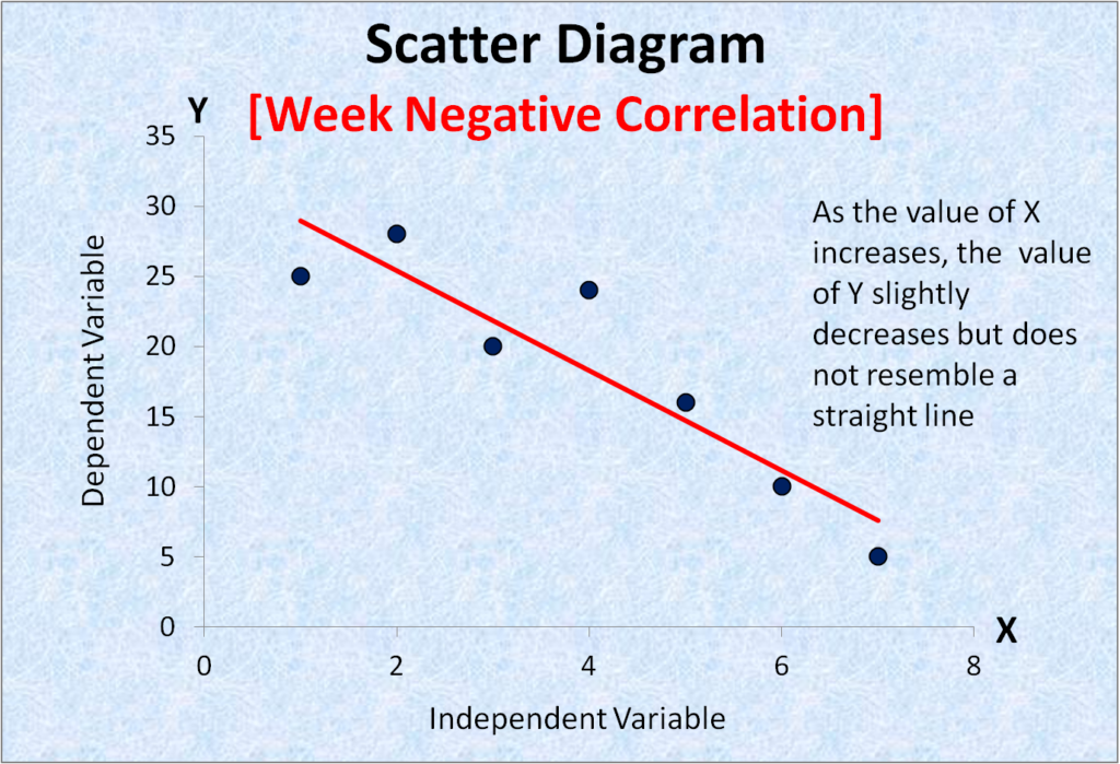
- Scatter chart with Week or Low Positive Correlation.
- Scatter chart with Week or Low Negative Correlation.
- Scatter chart with Weakest or No Correlation.
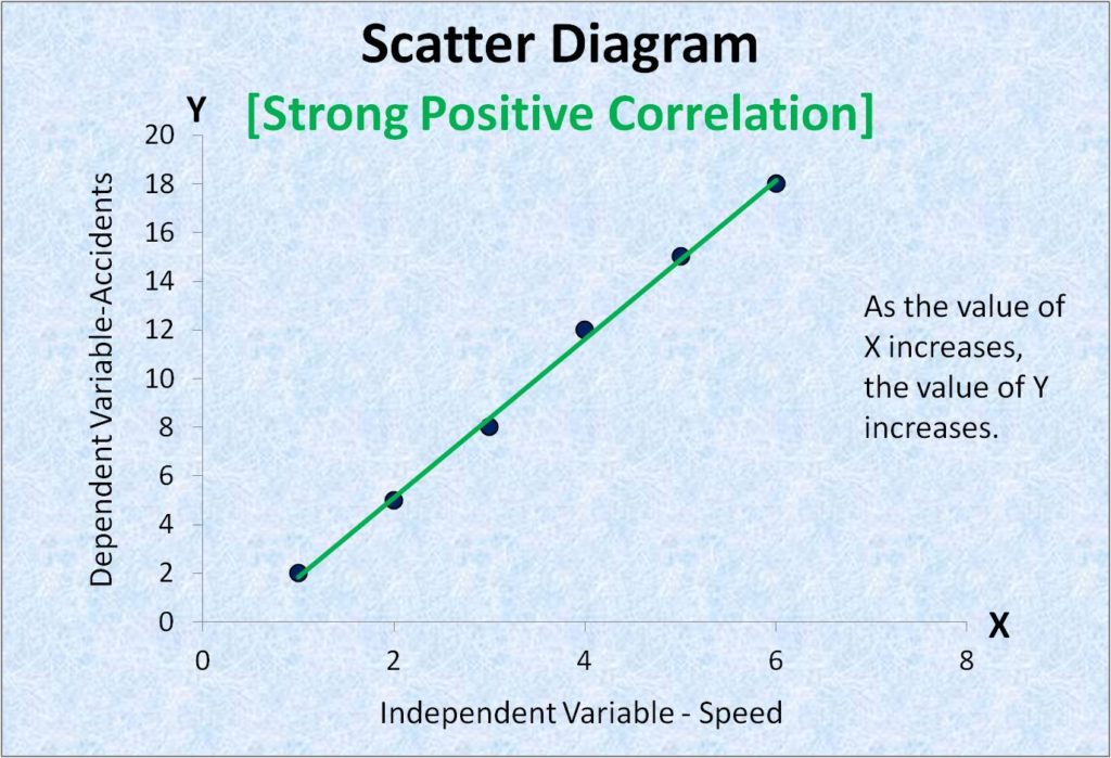
1. Scatter diagram with Strong or High Positive Correlation:
As the X value increases, the Y value also increases.
Example: Motorcycle Speed Vs Accident.
In the below diagram, the independent variable is speed and the dependent variable is an accident. As the speed of the motorcycle increases on the highway, the accident rate also increases accordingly.
2. Scatter diagram with Strong or High Negative Correlation :

3. Scatter diagram with Week or Low Positive Correlation :

4. Scatter diagram with Week or Low Negative Correlation :
5. Scatter diagram with Weakest or No Correlation :

Scatter Diagrams Applications
- Quality Control– To find potential causes of variation in a process.
- Engineering– To study the relationship between stress and strain.
- Business organizations– To analyze trends in sales vs. marketing spend.
- Healthcare– To relate patient age with recovery time.
Benefits of Scatter Diagrams
- Identifies correlation between two set of variables.
- It helps in root cause identification or analysis- using tools like Five Why and Fishbone diagram.
- Help tp supports hypothesis testing
- Encourages data-driven problem solving i.e. reduces assumptions and guesswork.
- Simple and visual i.e. easy to interpret and present.
Summary
A Scatter diagram is a simple but effective tool for examining the relationship between two variables. It is useful for root cause analysis and quality improvement since it visually verifies whether a change in one component affects the other by putting data points on a graph.